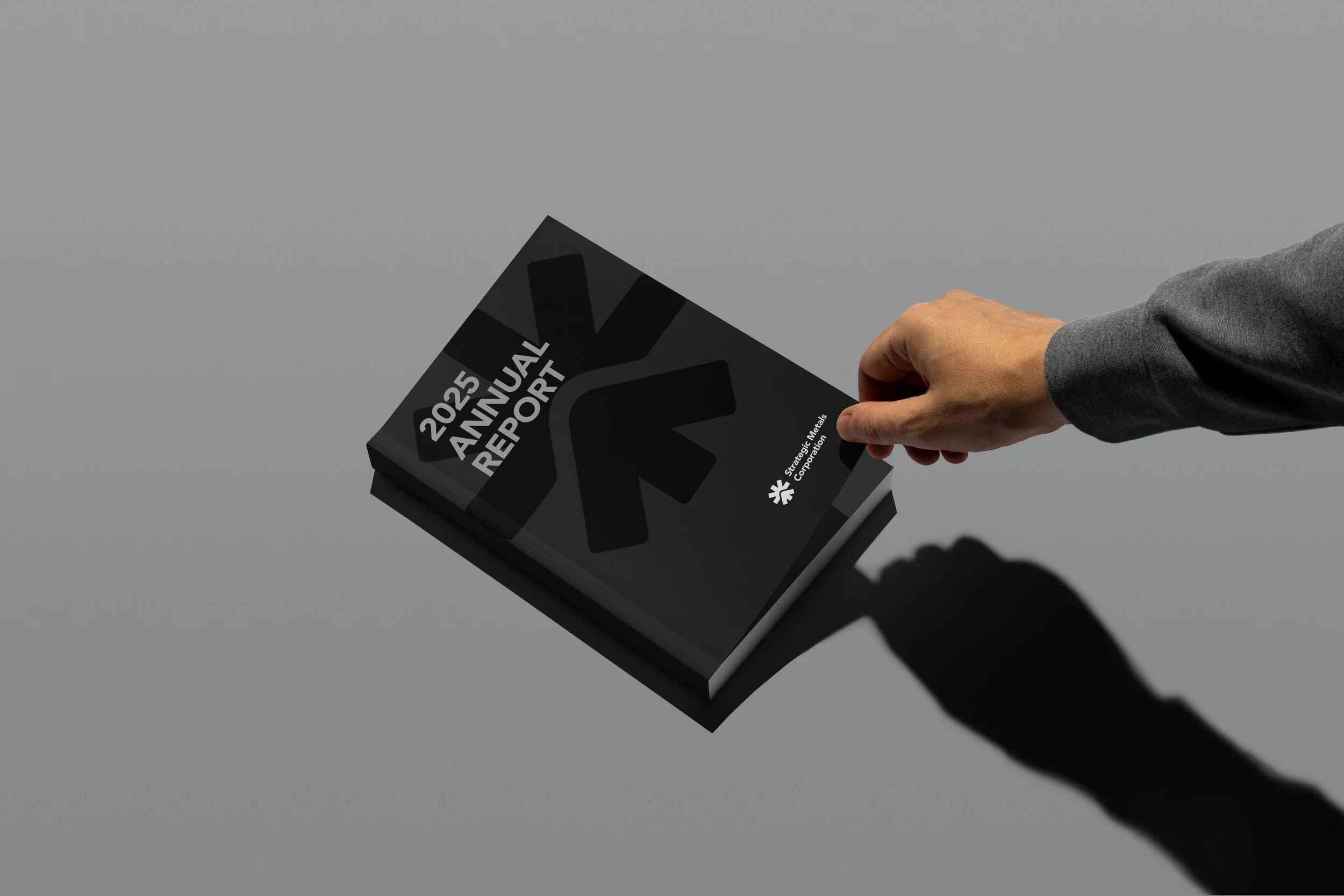
Strategic Metals Corporation
Strategic Metals Corporation required an identity capable of expressing more than its activity as a mining company. The challenge was to create a symbol rooted in the Peruvian landscape while communicating a vision of responsible growth and long-term value.
The identity is built around a single geometric mark that condenses the company's story into one visual gesture. Inspired by the Andes, the rising sun, and an upward movement, the symbol represents the connection between territory, opportunity, and shared progress. The resulting visual system is simple, distinctive, and flexible enough to support the brand across every corporate touchpoint.
SCOPE:
Brand Identity
Design System
Art Direction
TEAM:
Direction / Design: Christopher Pierce
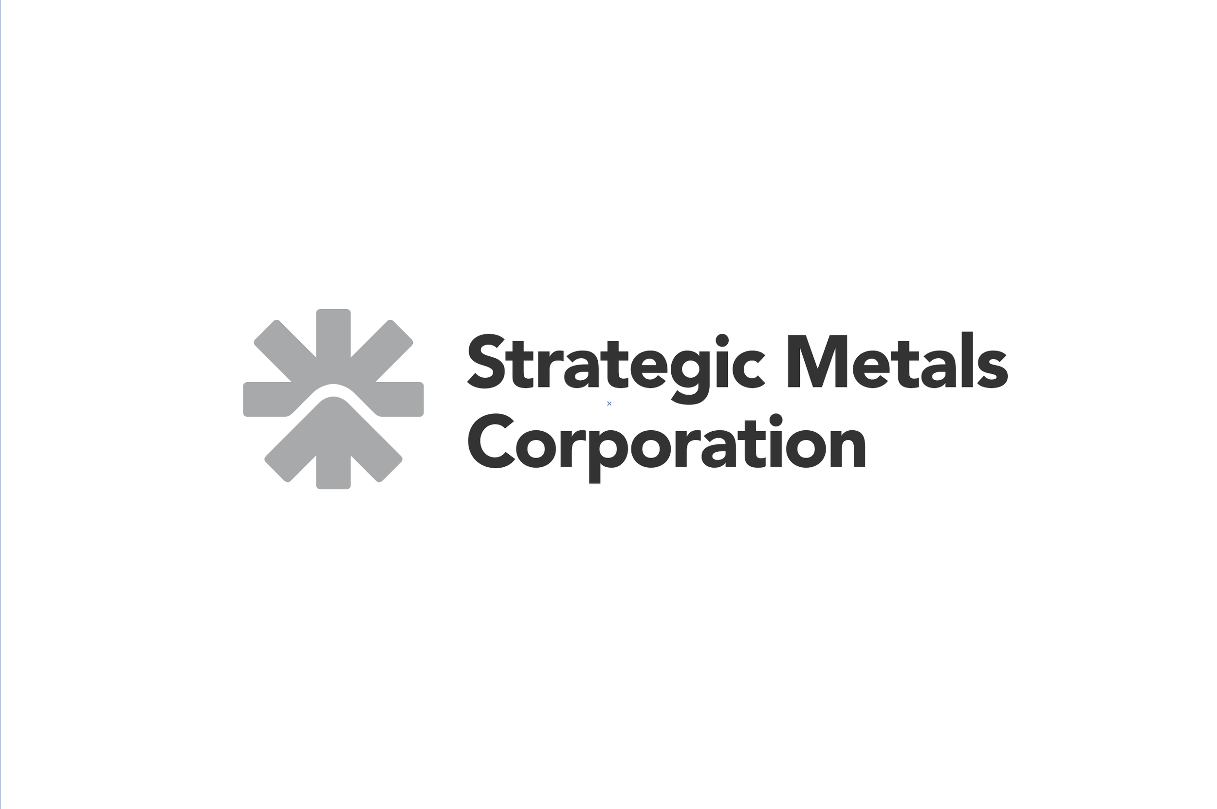
A single symbol inspired by the Andes, the horizon, and the idea of shared growth.
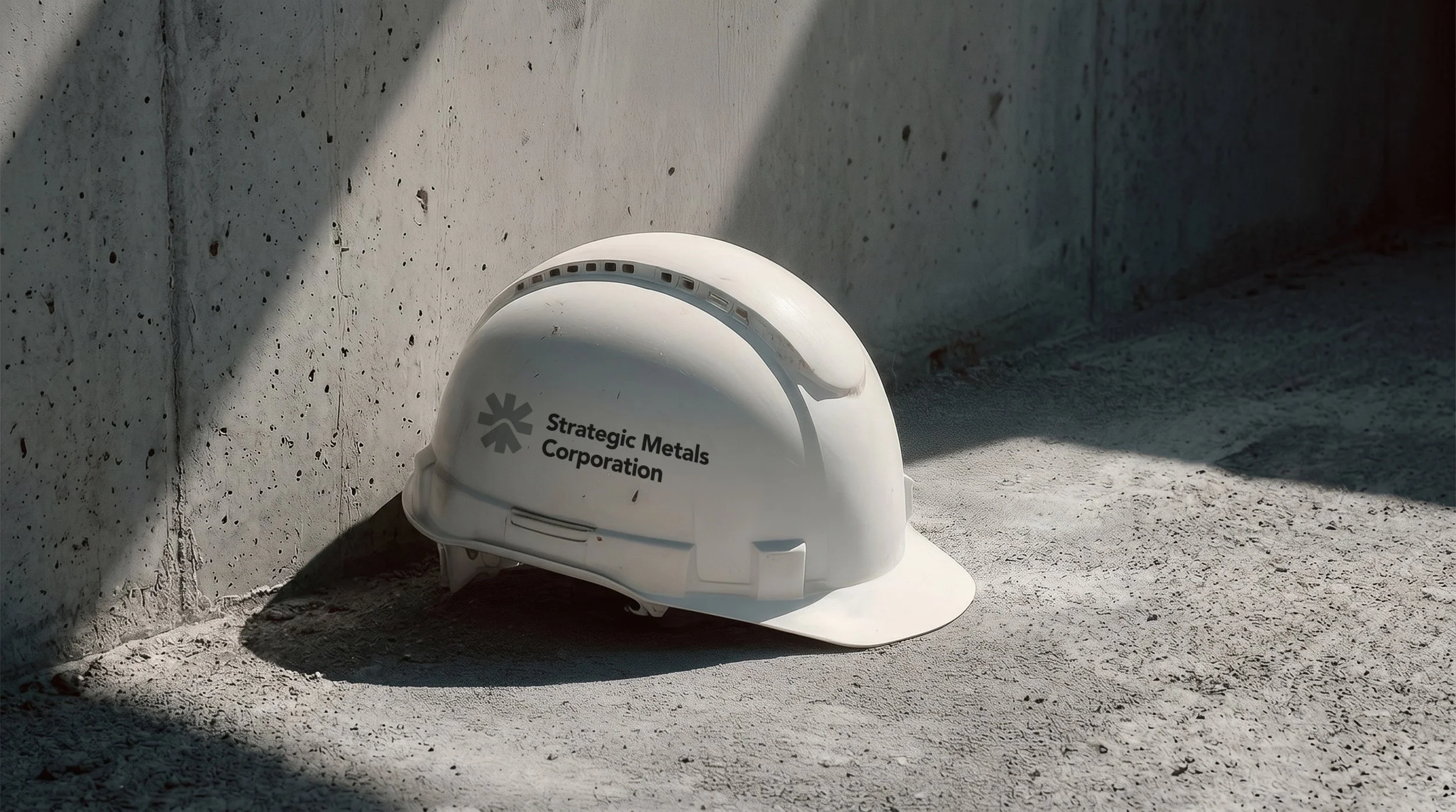
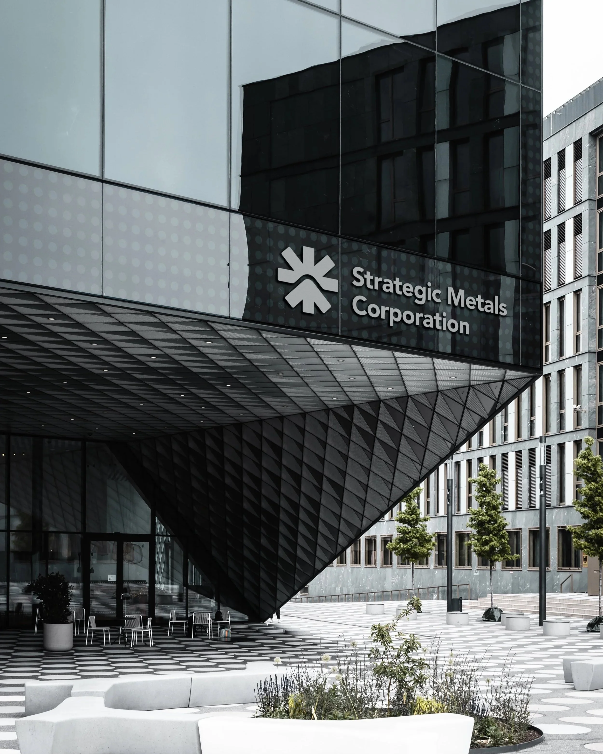
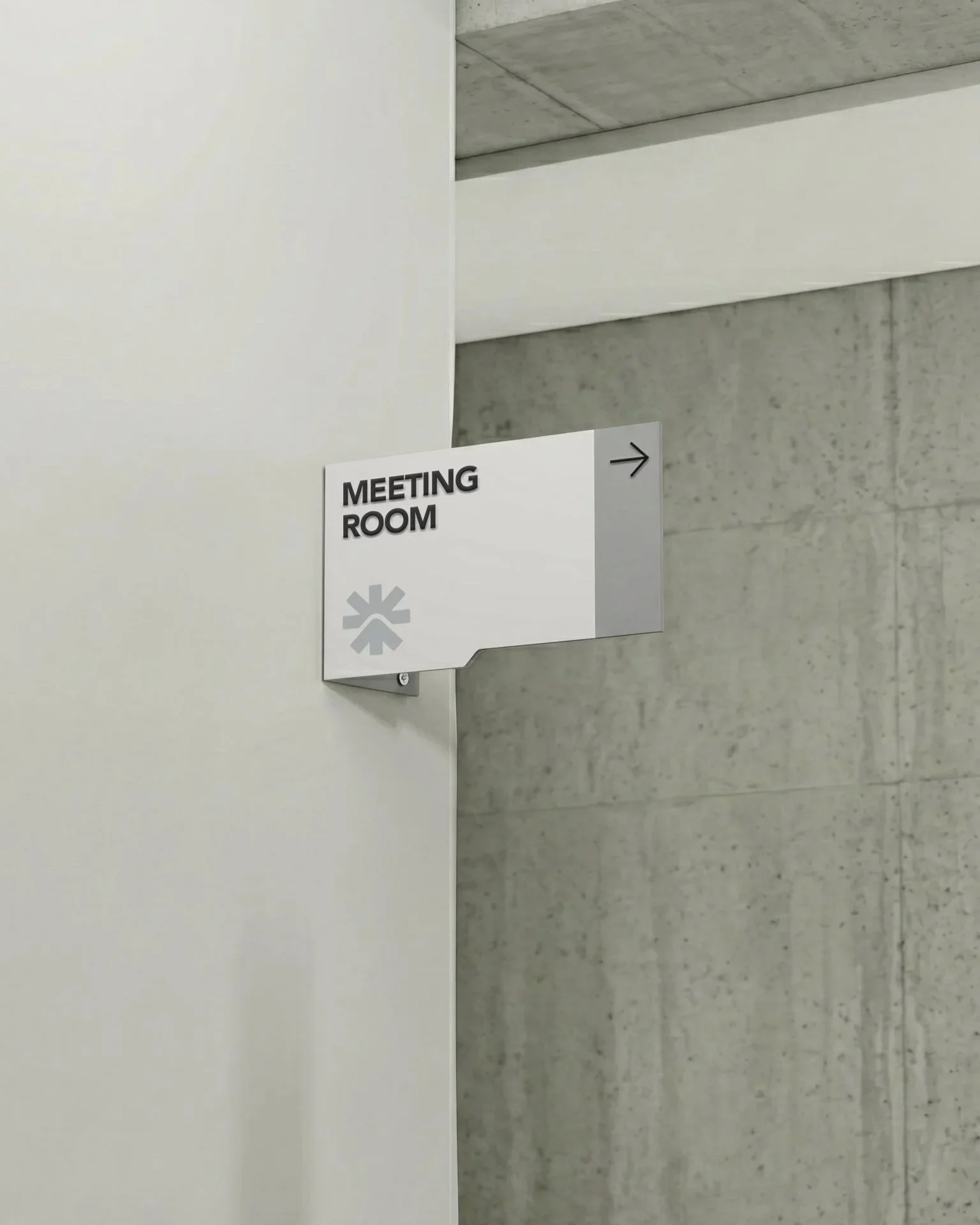
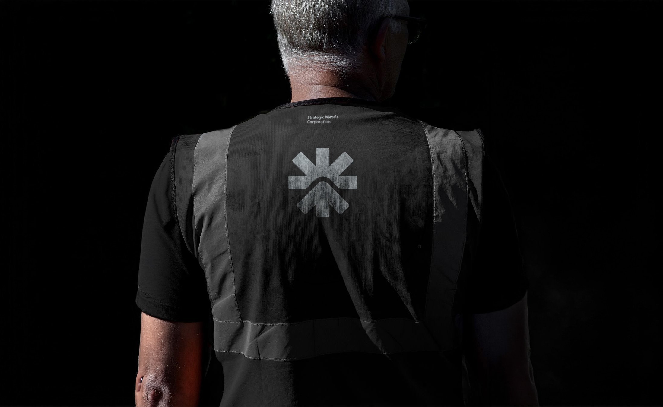
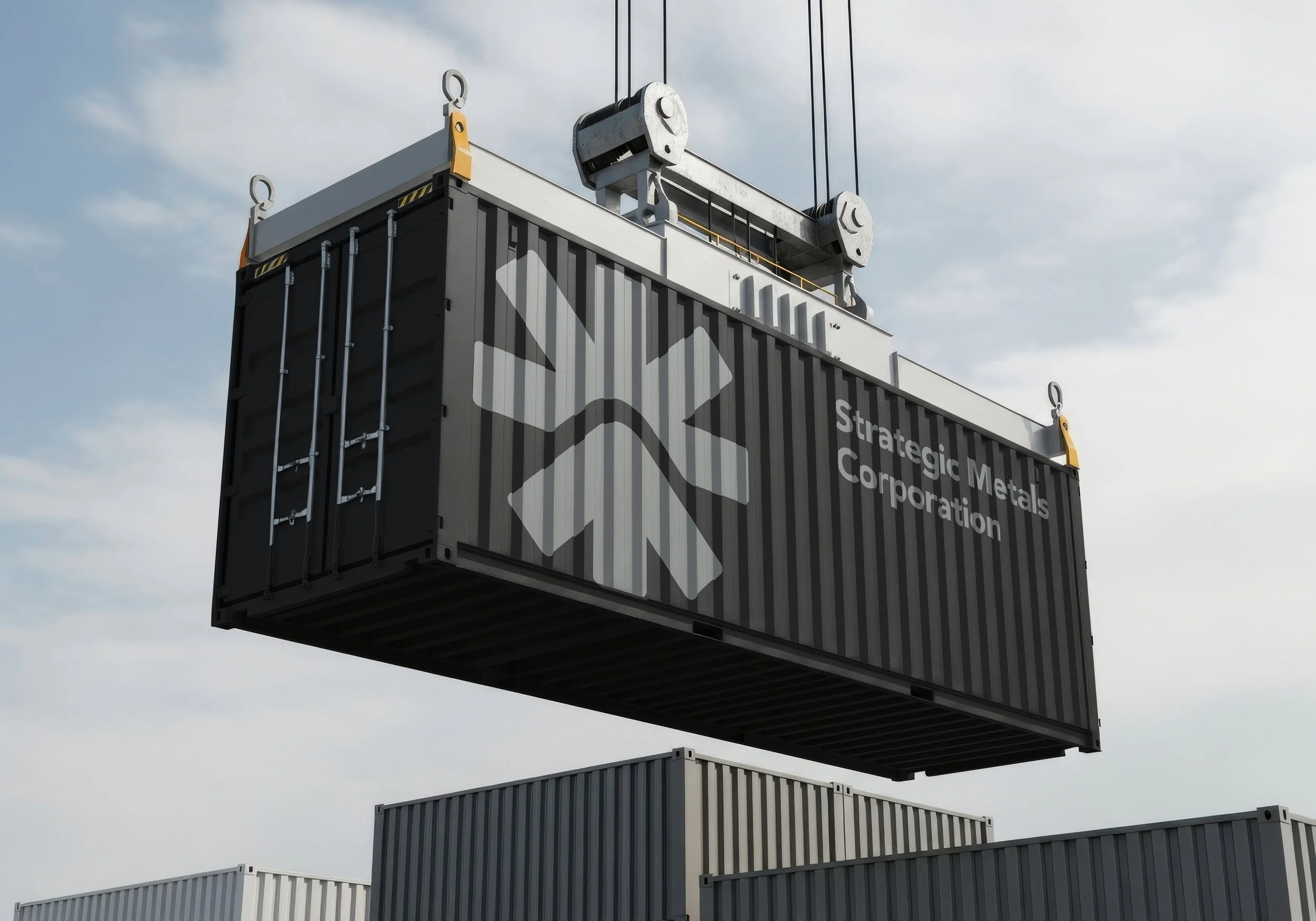
The identity transforms the company's vision into a timeless mark rooted in place and driven by progress.